
Brooklyn-based photography duo Lori Nix and Kathleen Gerber meticulously build three-dimensional miniature dioramas by hand, and capture the scenes using a large-format film camera. Read this Q&A session to learn more about their incredible process.
Besides moving into a small apartment, what inspired you to start creating dioramas and photographing them instead of shooting more conventional work?
Lori: We are most comfortable working with our hands. With my background in ceramics and woodwork, and Kathleen’s glass history, we are comfortable building our worlds rather than going out in search of them. Neither of us has had the financial means to travel much beyond the United States. We’ve always used our money to purchase tools and art supplies rather than plane tickets and hotel rooms. We’re happy enough to be armchair travelers, exploring the world through books, magazines, television and the internet. So instead of going out in search of worlds to photograph, we choose to build our own worlds in a much smaller scale.
How do you come up with your ideas? Do you keep a journal? What inspires you?
Lori: I’ve always taken inspiration from my surroundings. I grew up in [...] rural western Kansas. Every season brought with it a new disaster or weather phenomenon. [...] these events brought excitement to a life that by most people's standards was quite dull. I also grew up in the 1970s, when dystopian cinema had it's heyday. I remember being quite young and in the movie theater, completely scared yet excited to watch such movies as Planet of the Apes, Towering Inferno, Airport 76, Earthquake, and Logan's Run. These movies have had a not-too-subtle influence on my photography.
[Kathleen and I ] have lived in New York since 1999. Now the city has become our inspiration. I used get my ideas during the morning commute on the subway ride between Brooklyn and Manhattan. It has to be a combination of still being slightly asleep, the light that hits me when we come out of the tunnel and go over the Manhattan Bridge, and trying to maintain my sense of space while riding in a packed subway car. I kind of just drift off and let my mind wonder. I'm like a tourist in my own city, always looking up at buildings around me. The detail in the architecture is so incredible that I want to recreate it for my work. I have a stack of architecture books next to my desk that I turn to for reference when I'm not walking around the city. I don't keep a journal, but rather a list of potential subjects on my phone. Some ideas I sit on for years, others I like to start immediately. I'm completely fascinated with the apocalypse, the Anthropocene, and our reach into outer space.
Kathleen: I’m also a fan of science fiction, though I came to it later than Lori. The best of it raises questions about how the world and societies function (or don’t function). Or gives you a look at a world you’ve never imagined and it just gets the creative juices stirred up. I’ve also kept a sketchbook for years. I’m not sure it always relates directly, but it’s a valuable way for me to sort my thoughts.
Are there any art periods or styles that have influenced you? And how would you describe your own style?
L: We are greatly influenced by landscape painting, particularly the Hudson River School of Painting which included the artists Thomas Cole, Asher Brown Durand, Frederich Edwin Church, Martin Johnson Heade, and the Romantic painter Casper David Friedrich. Each of these painters possessed characteristics of romanticism and the Sublime and it's ability to create a state of mind and express intense emotions either through beauty or horror. Eighteenth century philosophers such as Burke and Kant wrote of phenomena that could excite sublime feelings when considering natural settings, dangerous situations, the unknown, and anything else that can threaten us or our belief that we live in a friendly and predictable universe that is under our control. The Sublime as a school of thought came to full force in the eighteenth century and was illustrated by these painters' grandiose landscapes.
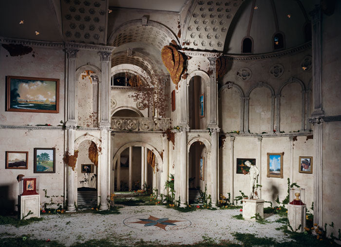
In our own work, Kathleen and I are interested in depicting danger and disaster, but temper this with a touch of humor. My childhood was spent in a rural part of the United States that is known more for it's natural disasters than anything else. I was born in a small town in western Kansas, and each passing season brought it's own drama, from winter snowstorms, spring floods and tornados to summer insect infestations and drought. Whereas most adults viewed these seasonal disruptions with angst, for a child it was considered euphoric. Downed trees, mud, even grass fires brought excitement to daily, mundane life. [...] For the series "The City," I have imagined a city of our future, where something either natural or as the result of mankind, has emptied the city of it's human inhabitants. Art museums, Broadway theaters, laundromats and bars no longer function. The walls are deteriorating, the ceilings are falling in, and the structures barely stand; yet Mother Nature is slowly taking them over. These spaces are filled with flora, fauna and insects, reclaiming what was theirs before man's encroachment. I am afraid of what the future holds if we do not change our ways regarding the climate, but at the same time I am fascinated by what a changing world can bring.
Do your pieces have messages for on-lookers? Is there any modern day issues or causes that you try to raise awareness to in your work (In reference to your current work in The City) or is it just to excite the imagination?
K: We do not strictly define what has taken place in the photographs. Clearly, we have a general theme - something catastrophic has happened, mankind is gone, all that is left are empty buildings and abandoned landscapes - but the details as to what actually occurred are purposely left fuzzy. That allows the viewer to bring in their own ideas (or fears) as to what happened. The fact that it is an image of a model and not a real place, can make it easier for viewers to place themselves into the scene and imagine what may have led up to this point.
Your work is labor intensive. Talk me through the creative process and techniques that go into making one of your projects.
K: Because we have been working together for 18+ year now, we each have different roles in the creation of the work. Lori is the architect and I am the sculptor. Lori is responsible for hard surfaces such as walls, floors, furniture, buildings etc. I take care of the detail items such as paint finishes, small props, and generally distress everything. If it takes patience, I’m going to do it. If it involves a ruler and a table saw, then it falls to Lori. In “Anatomy Classroom” I sculpted the anatomy models and skulls out of polymer clay. I created all the specimen jars, the posters and the overhead projector. Lori built the cabinets, chairs, laid in the floors and put up the walls. I then distressed and partially destroyed the scene, readying it for the camera. When my part is done, Lori sets up the camera, lights, the background scenery and begins the process of capturing the final image.
A diorama can take anywhere from three to seven months, but a few have taken as long as fifteen months. We work on two and three at a time. Most of the fabrication takes place in our apartment because that where all the power tools, spray booth, paints and supplies are located. When the work is close to being finished, we pack up the parts and pieces of the diorama and transfer it to our outside studio where there’s more space and where we keep the lighting equipment. When we install the scene out here, it’s usually the first time we see it as a whole. And when we see it all together, there’s usually something amiss and we need to add more detail or more background to a scene.
What advice would you give a young artist that is just starting out?
L: I took the long path to get to where I am today. I started applying to juried shows, then to non-profit shows. I also applied for programs such as the Artist in the Marketplace through the Bronx Museum of Arts, another artist network. As I built up my resume and got a little press recognition, I started to approach commercial galleries. As I had more shows, my work began to spread. It's very important to have a good website. I can't stress this enough.
Good projects take time to develop. Do not be in a great hurry to start and finish a body of work.
Be sure to have a day job. Surviving on art work alone is a rare feat.
Your friends are your greatest source of information sharing. They are the ones who will help out your career the most with gallery connections, inclusions into exhibitions, and spreading your name around to their friends. I am indebted to a lot of my friends for getting my career to where it is today.
Visit Bau-Xi Photo at 350 Dundas Street West to see Lori Nix and Kathleen Gerber's solo exhibition, The Empire, The City. Click here to read about this show, which has been selected as a Featured Exhibition for the annual Scotiabank CONTACT Photography Festival.


 Jeffrey Milstein, Newark 8 Terminal B, Newark, NJ


 Untitled 14
 Untitled 15
 Untitled 16


